


030: Swimming pools, vintage bowls, and Wimbledon
Sporty vibes this week.

Graphic design, visual delights, and things worth noticing, delivered twice a month.
Happiest of Mondays, my friends. Hope you had a great weekend. I have so many things to share with you today.
Some housekeeping:
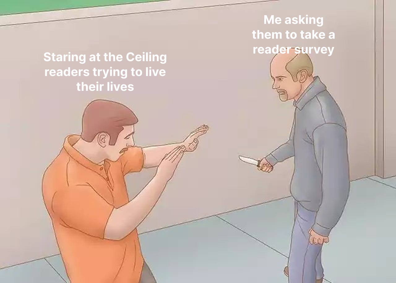
I put together a quick reader survey and would love to hear your thoughts. It takes less than 2 minutes and your answers will help me make Staring at the Ceiling even better. It will also make me eternally grateful. Click the button below to dive in.

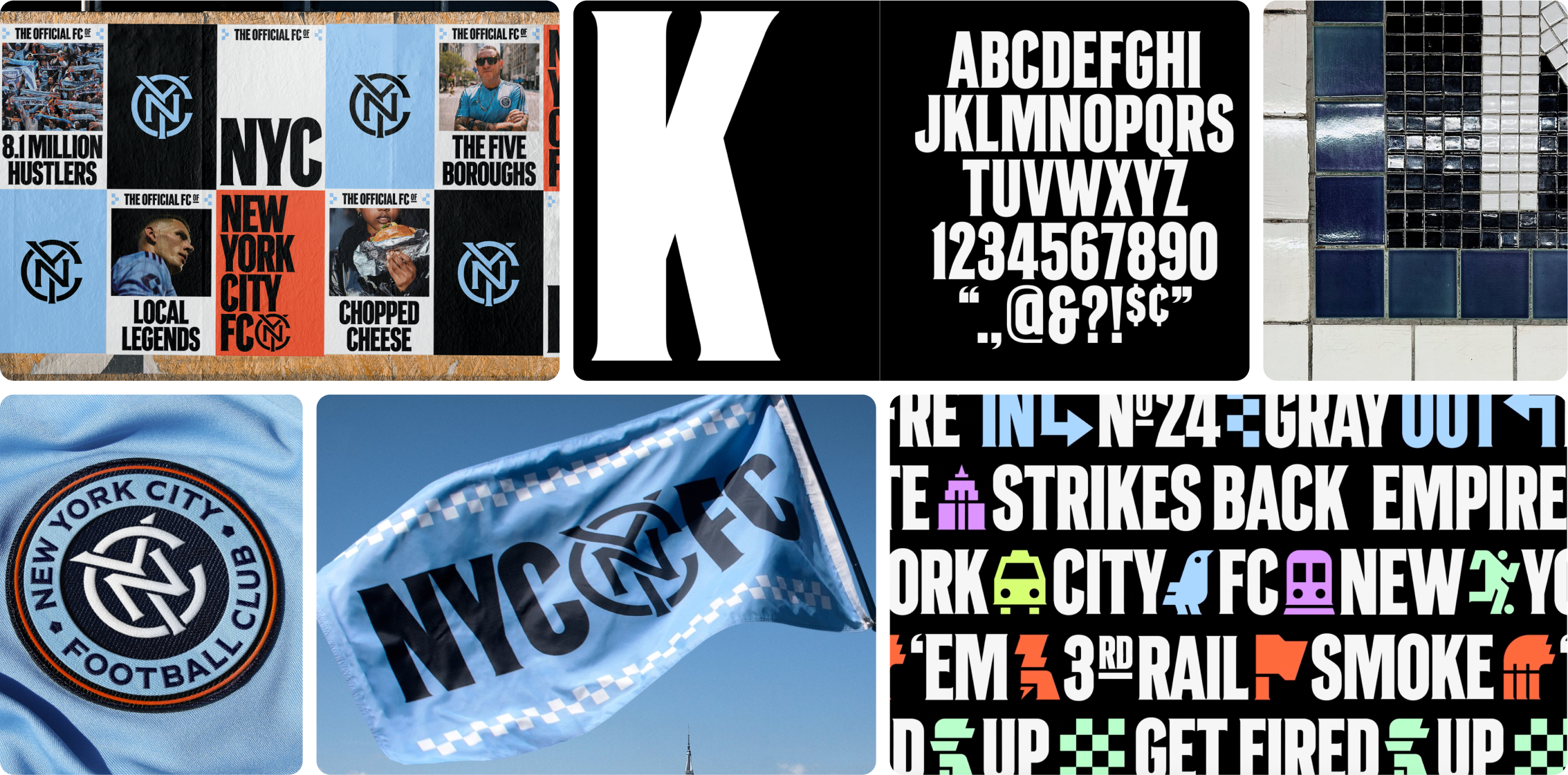
🖍️ NYC FC brand work by Gretel
If you live in NYC, maybe you saw the 700-pound, five-story high inflatable pigeon overlooking the Hudson River. It was a part of a hackneyed but fun brand activation for the NYC’s MLS team which has recently undergone a transformation ahead of the 2026 World Cup.
This was a huge rebrand with design elements executed pristinely. The typography is inspired by pre-modernist subway tile signage, refined and expanded upon. The icon system is clean and interesting. I thought they did a great job marrying the classic and modern, and capturing the energy of the city and its fandom.
Here’s what my soccer-player/fan/brand strategist fiancé James had to say about the work:
The identity's energy, five borough references, and mosaic elements look cool and will look even cooler in the fancy new stadium coming in 2027. However, NYCFC is owned by a global soccer conglomerate which has essentially gentrified the spirit of soccer and cheated its way to the top of the Premier League, so claiming local credibility is a bit of a tough sell for me.
Putting my brand strategist hat on, I wish they had a brief that was more about what NYCFC can say that other MLS cities can't: America's only truly global city + global sport + global club = NYCFC. They almost got there with their spec billboard that has soccer written in different languages. More of that, less bodega cats and chopped cheese.
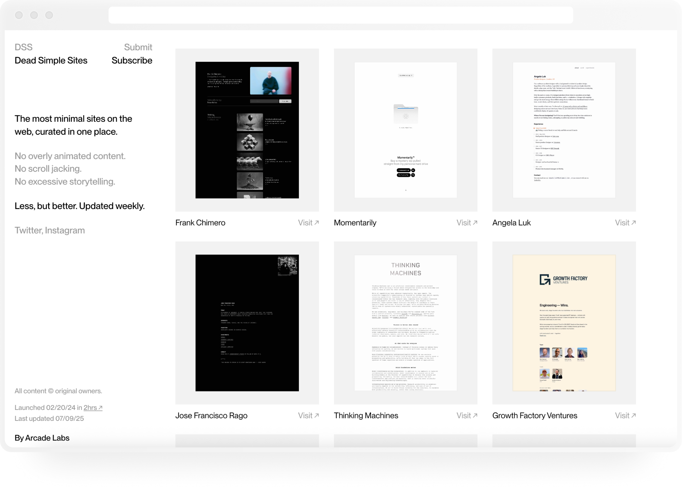
🗄️ Dead Simple Sites by Arcade Labs
A gallery of beautifully designed minimal websites. Perfect for portfolios imo.
A great mockup tool with a huge library of surfaces, including apparel, devices, and some abstract 3D shapes and icons. It also has animation and expansive customization features for lighting, background colors, rotations, etc. with great templates available.
🔤 Good Glyphs by Violet Office
A dingbat font created by a group of designers, with each one creating a symbol for one letter. This is such a fun idea, I might just steal it for a future prompt.
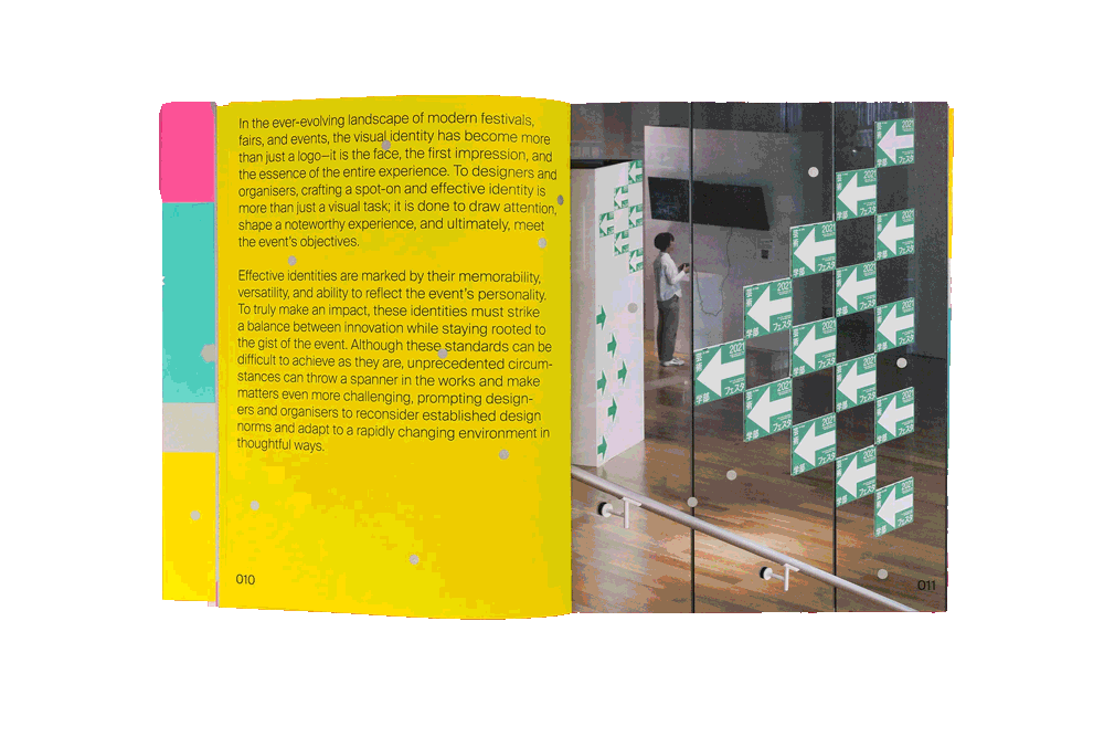
📖 Graphic Fest 2 by Victionary
Graphic Fest 2 is the second edition of Victionary’s collection of brand identities for events and fairs. It has a wide breadth of work, highlighting individual designers and their work for Netflix, the New York Times, and Paris Electronic Week. I always say this…but this is a favorite of mine that I reference often!
Some more things worth noticing:
🛠️ TinEye reverse image search
A reverse image search engine that’s better than Google because it can find sources and moderated versions of images. I use it all the time to source visuals for the newsletter.
Excellent use of creative energy.
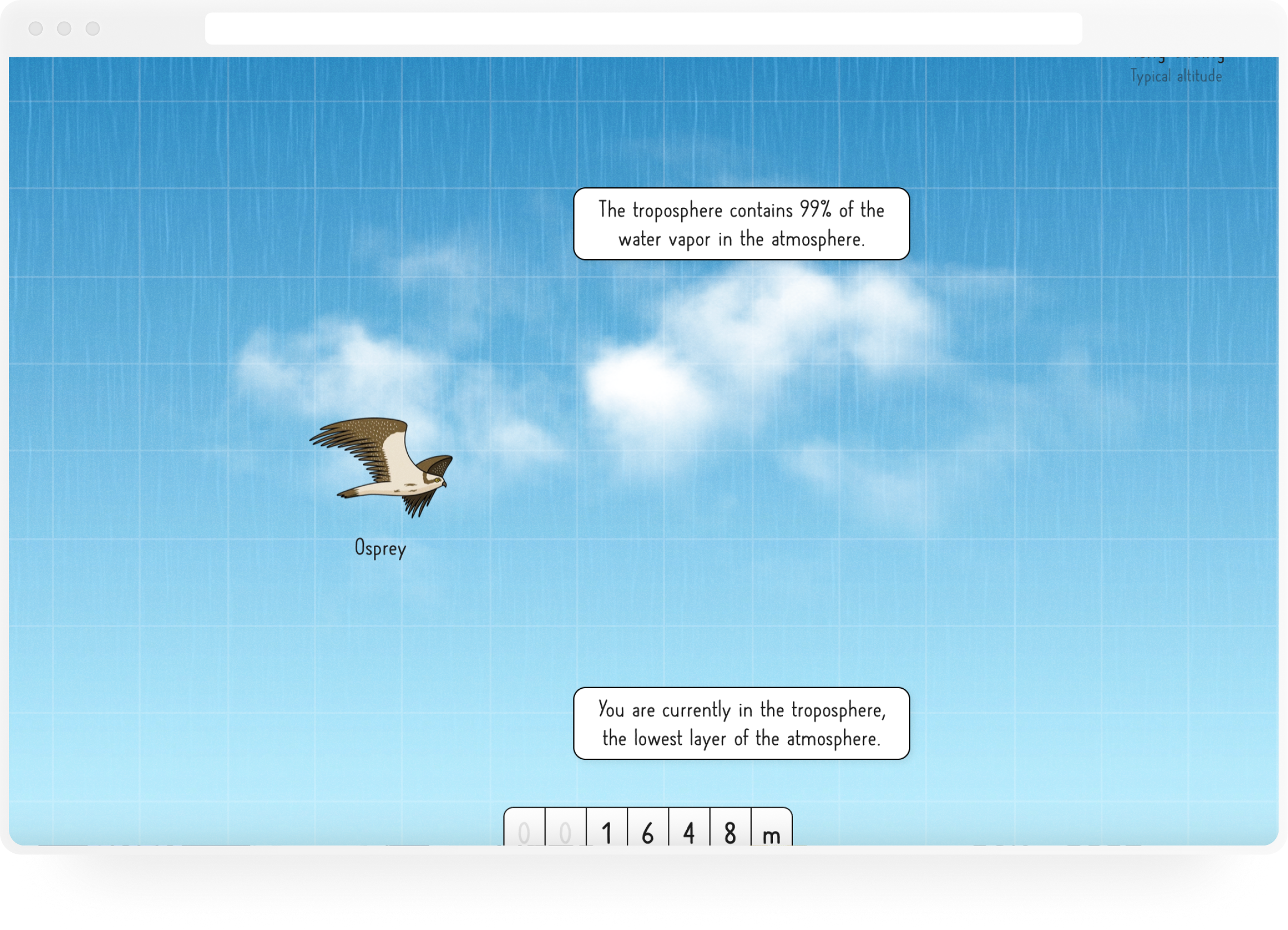
🌀Space elevator by Neal Agarwal
A fun experience where you get to scroll from Earth all the way up to outer space. Did you know that there’s a point in the stratosphere where your tears and saliva will boil?
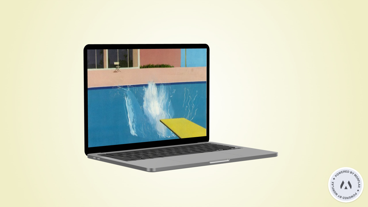
🎬 In the Deep End: Swimming Pools On-Screen by The Criterion Channel
A collection of movies featuring memorable swimming pools. Films include The Graduate (1967), La Piscine (1970), and Wild Things (1998). So far this month, I’ve watched 3 Women (1977) and A Bigger Splash (1973)—one is a Robert Altman directed dreamlike sequence following three women in southern California and the other is a documentary exploring David Hockney’s lingering breakup. I loved both!
“Those uncanny, aqueous environs where interior collides with exterior, the private flirts with the public, and time seems suspended above the watermark.”
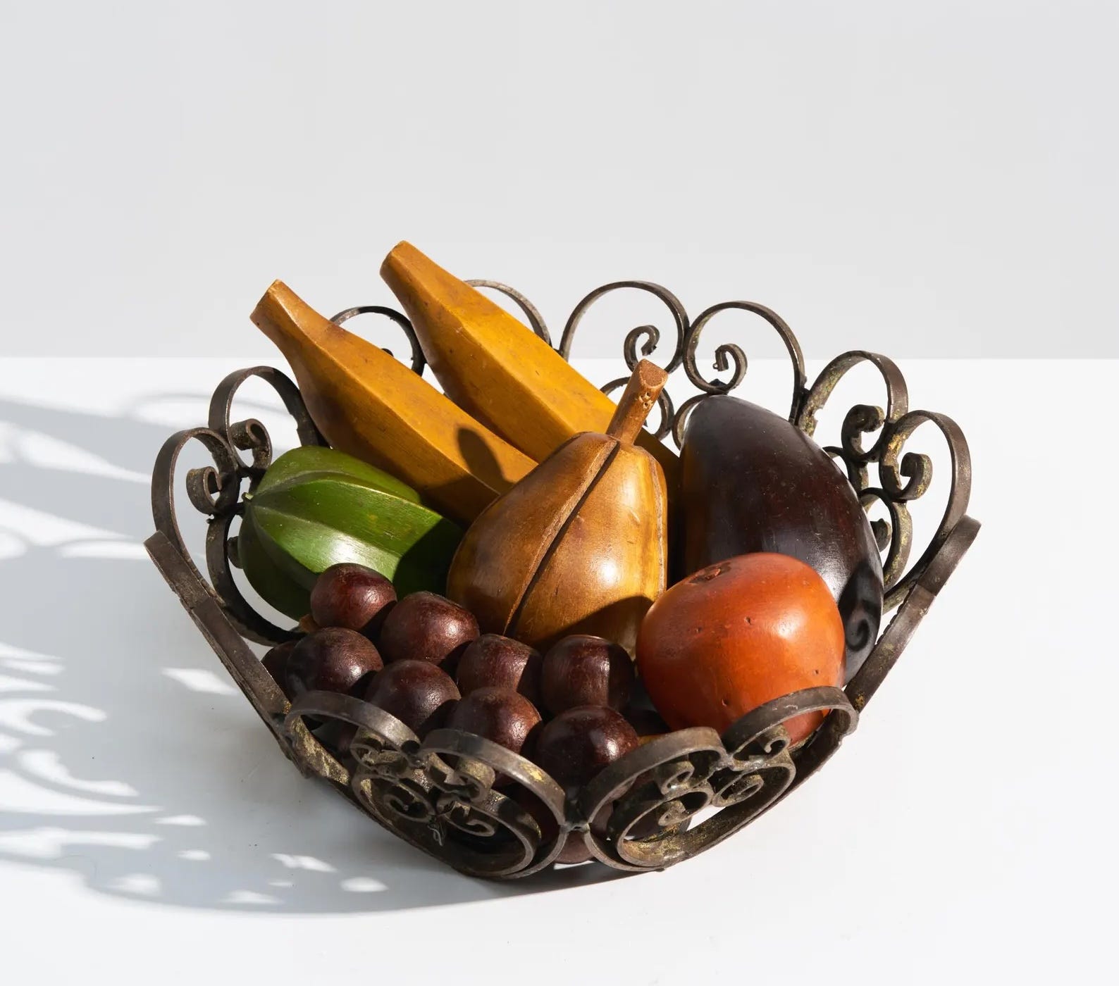
For your fruit or your soaps or your mail or your keys.
🎥 The latest season of Taskmaster (Series 19)
Taskmaster is a delightfully chaotic British comedy panel show. This last series was a hoot, but if you’ve never seen it before, I recommend series 4 as a starter.
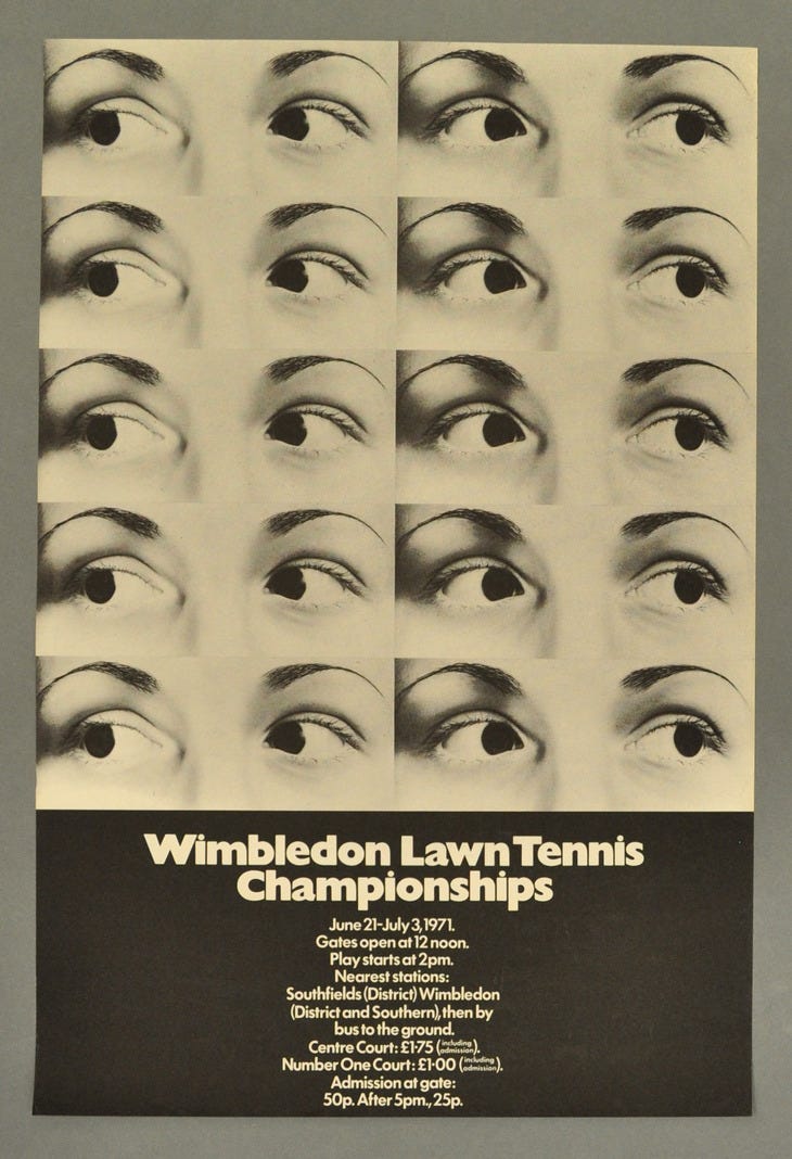
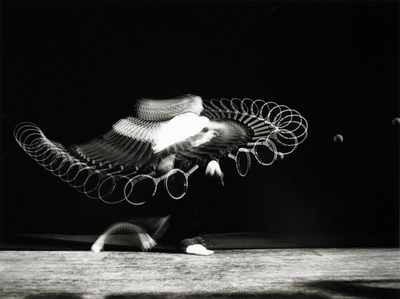
🖼️ Wimbledon posters through the years
I <3 tennis season. Take a look at these very cool posters dating back to 1893.
🎶 My song of the summer for the past five summers
There may not be a song of the summer but this is mine.
In case you missed it:


Bye!! Don’t forget to take the survey 👿 😇.
See you next time. You can expect this newsletter in your inbox on the first and third Monday of the month.
If you’d like to support the newsletter, you can buy me a coffee.
Ahh!! So excited to get a mention 🥰 Love this list, and excited to check out the other creators on it
That fruit bowl!!!!