


011: Symphonic identities
Zooming in on the visual language of musical institutions via symphony orchestra rebrands.

Welcome to Asset Library, my graphic design newsletter where I share inspiring and interesting design, tools, articles, etc. on the first Monday of the month.
🫵 This is a long one, so you may need to read it in your browser.

Putting on my critic hat👒 today and trying something a lil different.
🎻 Symphony Orchestra Branding
I recently came across the São Paulo Symphony branding and that reminded me of the San Francisco Symphony work and that reminded me of the Milan Symphony branding and it made me want to do a deep dive into their brand identities. I find myself drawn to how these institutions refresh their brands, each using unique design language to represent how music makes audiences feel. Orchestras are not just cultural institutions; they are essential for artistic expression, community engagement, and the preservation of centuries-old traditions. The visuals act as a vessel for communicating musicality, emotion, and local culture.
When companies rebrand, they aim to address a variety of challenges: changing market conditions, negative reputation, repositioning, outdated brand identities, among other things. Similarly, these orchestras have been rebranding in the past decade for multiple reasons: changing demographics and audience expectations, the desire to expand what classical music can look like, changing leadership models within the orchestras, etc. Embedded within these changes is a clear desire to leverage innovative technology both to draw in audiences and to dispel the notion that these orchestras are stuffy and outdated (more on that later).
This is a roundup of a few major and memorable orchestra rebrands in recent years. I listed them roughly from least to most fave.
Smoothest Vibes
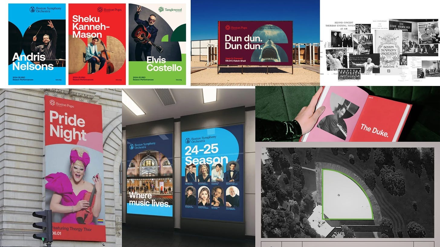
Boston Symphony Orchestra’s branding left me feeling disappointed given the city's roots in classical music and the orchestra’s stature as one of the "Big 5." The design felt too modernized—too reliant on sans serif type, too flat, too smooth. I got a paid ad for AT&T and it reminded me of their visuals :(. Though inspired by its architecture, it lacked the connection to the rich history of the orchestra, leaving me wanting more of a tie-in to its heritage and the beautiful art nouveau artifacts they showed as part of their inspiration. In trying to modernize, I feel it missed the emotional resonance that classical music evokes, and instead, ended up looking more like a fintech startup than a cultural institution.
Most Techy
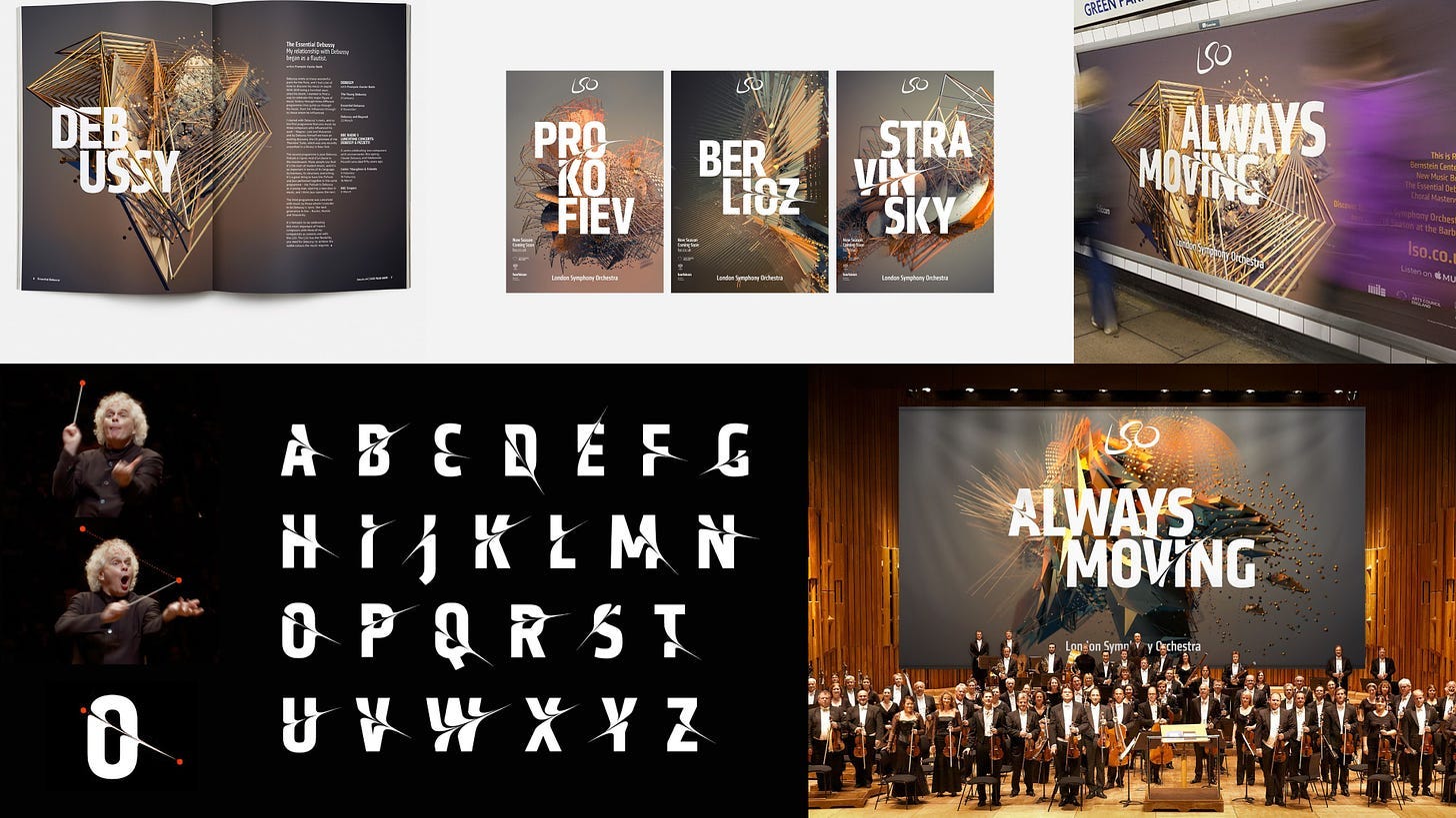
London Symphony Orchestra’s design, while clever, left me feeling ambivalent. It’s contemporary in its inspiration: the physical movements of its conductor and its musicians executed through its swooshy custom type. It’s also inventive in its use of motion data technology to capture the movements of its musicians to create abstract geometric shapes that serve as their primary use of imagery. However without that context, the imagery just looks like AI and falls flat when paired with the grandeur of its concert hall full of musicians or in an ad in the Underground. The instinct to center its subjects was there, but the execution was convoluted in its use of technology. Ironically, in attempting to highlight its people, it diminished their presence and lost some of the vital cultural context that appeals to the average audience member.
Runner up for Cleverest Logo
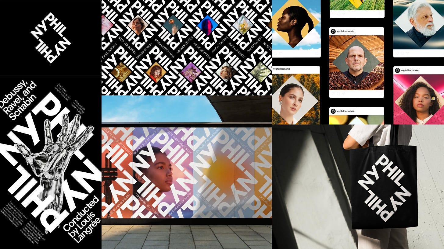
The New York Philharmonic's branding is more conceptual, with minimalist, black-and-white visuals that use pattern to evoke a sense of movement. Like the BSO’s visuals, their logo is inspired by the concert hall’s architecture and cleverly shines the spotlight on their musicians and focuses their visuals on the institution itself through negative space. Its use of imagery puzzled me because I know I’ve scrolled past that silver hand on Unsplash one hundred times (same goes for their other mockups’ background imagery) and it felt a bit generic. That element felt disconnected to me, like it wanted to have splashy youthful photography but they ran out of time to think through the art direction (for what it’s worth I think their most effective assets feature their own people). I think it’s effective overall and it feels strong and confident, very New York.
Most Gen Z (compliment!)
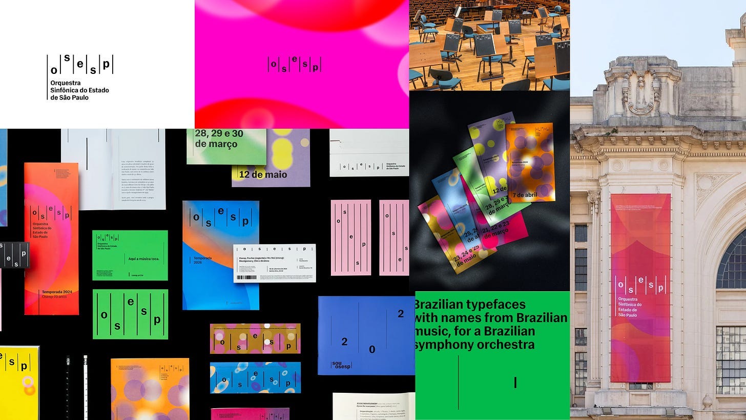
São Paulo’s identity is fluid and full of depth and rhythm, capturing the city’s energy. I think this one is the most effective at being approachable—it’s inviting, colorful, and friendly. There is a sense of order among the chaos provided by the vertical lines symbolizing musical notation and rhythm, balanced by the oval abstract visuals. This direction is all about harmony—between young and old, straight and curvy, color and lack thereof. I also felt it was the ~youngest~ identity with its use of lowercase type, very Gen Z.
Intermission: About Tech
São Paulo used a generative design tool to help the internal team create abstract compositions of ellipses based on a piece of music, giving them an endless source of imagery. San Francisco used the Symphosizer, a musically reactive modular variable type tool to add an extra contemporary and unique element to their typography. London used motion capture data to create 3D renderings of human motion, creating an abstract visual representation of its musicians. What feels at odds with these aging institutions is the use of tech for splashy PR, using it as a bandaid for what seems to be larger issues within the orchestras themselves (I’ve seen Tár). On the creative side, I think the goalpost for designers keeps moving further and further, giving only organizations with money and resources to be able to provide these impressive technological solutions. Solutions that, in some of these cases, didn’t feel additive or impactful. I bring this up because I wonder if this is the direction we’re going in as a creative industry. Is showy technology making the design better or is this just better PR? I’m curious to hear your opinions.
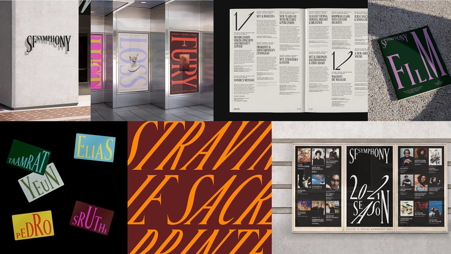
Funkiest Typography
The San Francisco Symphony work is one I often look back on for inspiration—it’s smart, expressive, type driven, energetic. Its use of serif type is full of character and isn’t afraid to feel light and fun. It balances expression and structure, which I think is what makes it so impactful. It’s so good! Try out the Symphosizer, it’s really fun.
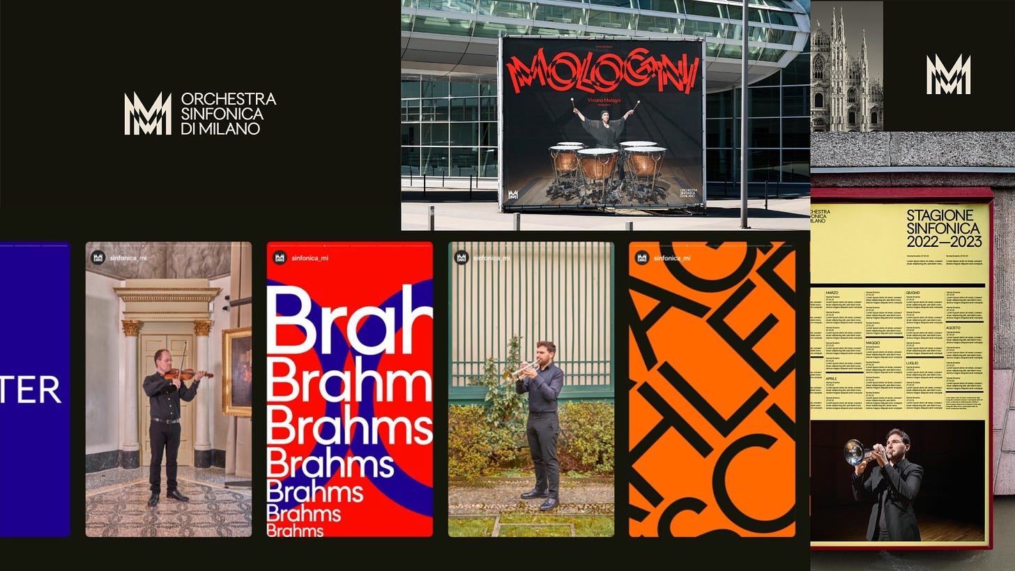
Best Use of the Pathfinder Tool
Milan Symphony Orchestra’s branding is sharp, vibrant, and inspired by the city’s architecture and futurism movement. The type driven design creates dynamic and dizzying shapes and musically responsive animation, blending clean design with organized chaos. I think this expressive use of type is most effective paired with photography of its musicians, making the visuals energetic and engaging; modern and rooted in its culture.
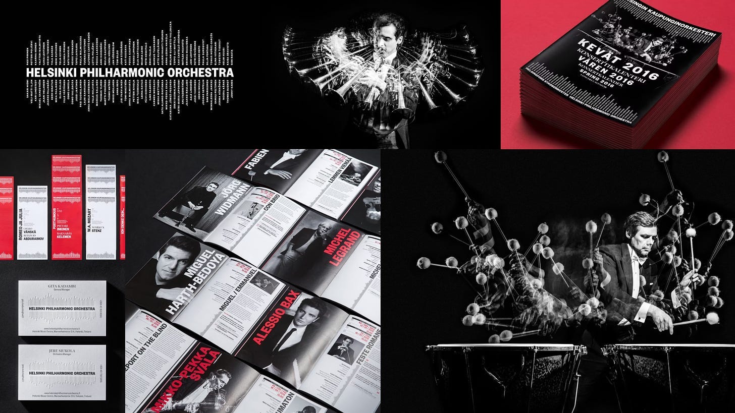
Best Photography
Lastly, the Helsinki Philharmonic’s branding is beautifully elegant and minimalistic. What I love most about this identity is how it highlights the power and unity of the orchestra’s 102 musicians by adding their names in the logo’s audio waves. Likewise, the multi-exposure photography adds depth, creating a sense of sound and movement that brings the musicians to life. It not only captures the essence of the orchestra but also makes them look cool as hell.
In writing this, I found that what drew me to these pieces of work wasn’t just the craft and beauty in the design or the institutions themselves. There’s tension presented, in old institutions attempting to hold on to relevancy, in hoping visual identities can fix a larger problem. There’s tension in its misguided use of technology to be showy and appeal to changing audience expectations. From a visual perspective, these brand identities work on many levels and it was enriching to see how they reflect their cultural footprint, their cities, and their vision for their future. They all made me feel something, I hope they made you feel something too. brb getting tickets to the orchestra.
*~Here’s a few more links if you’re still here~*
🛠️ Motion Design Principles
This is a great site for UI/UX designers that shows how animation conveys a brand’s personality. Fun navigation, clever, and educational.
🌀 Stay trendy
A designer-led visual documentation of trends in graphic design.
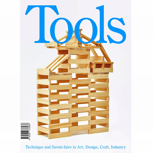
📖 Tools Magazine’s gives craft a contemporary image
I feel very inspired to work with my hands and practice crafting and creating more this fall. My issue just arrived in the mail and it’s as beautiful as it is educational.
Tools annual publication aims to simultaneously promote and investigate the details of manufacturing techniques and expertise used in art, design, interior architecture, industry and trade. Each issue focuses on a particular technique (moulding, folding, etc.), and the theme is used to select feature subjects and pieces, as well as the persons interviewed. The second issue is dedicated to weaving.

See you next time. On the first Monday of the month, you can expect Asset Library and on the third Monday of the month you can expect In the Clouds in your inboxes.
This is a great critical look! Thanks for sharing.
This deep dive is so good! I love the SF typography and the Symphosizer is pretty cool too. Less enthused about the use of generative AI for São Paulo, mainly because it just seems like a totally unnecessary gimmick.
Do ballet companies next!!