
013: wellness branding, romance novel covers, and type trends for next year
Rebrand discourse got to me.

Welcome to Asset Library, my graphic design newsletter where I share inspiring and interesting design, tools, articles, etc. on the first Monday of the month.
🫵 This is a long one, so you may need to read it in your browser.

🌀 An amazing collection of 1950s and 60s hotel labels by Present and Correct

🛠️ A template for organizing design systems
Very detailed and helpful, from the lovely Figma community.

For the brand guidelines nerds.

🖍️ Rebrand Roundup
Some thoughts on brand work that got me worked up.

Aeromexico: The discourse around this rebrand was predictably divisive. Some likened the new Aztec eagle warrior design to El Chavo del Ocho, claiming it lost its strength and character. I have to agree that the eagle head feels like a downgrade—the 1988 version is my favorite—but the typography is an improvement, more balanced and refined. Minus the eagle head misstep, the visuals now come across as more premium and cohesive. The new navy blue soothes me.
What struck me was how passionately people (not even Mexicans) discussed this rebrand, as if this airline was an untouchable spearhead of Mexican identity, and changing it somehow pointed to the decline of the nation itself. I get it: it's true that the previous eagle, inspired by Mexican art and architecture, had become iconic. I guess I find it hard to believe people feel this strongly about an airline and that this airline is a country’s most emblematic brand. All in all, the new version lacks the personality and cultural resonance that made it stand out in the first place.
On a broader note, I’ve been finding myself exhausted by rebrand discourse online. People get overly fixated zooming in on elements like optical alignment and miss or omit the broader context. I think good design is often good despite these details—the kerning, the leading, the spacing—and what makes it truly good is taste, context, risks, how it fits into its design system, and a slew of other factors. Good design is a mix of both the big and small, but it feels like critiques online are made in bad faith and for the sake of nitpicking. But then again, what am I doing here?
Figma: I love how playful and vibrant this refresh feels. It’s an apt change, given how much Figma has grown outside its original intended audience.
As we’ve expanded beyond our singular design focus, we recognized the need to move past a visual language rooted in vector vernacular—the static cursors and heavy black outlines that defined our brand for the past five years.
I like how the visuals live in the world of play and creation: “in the sandbox,” as they put it. Their creative team is so skilled at creating visual languages that evolve with the needs of its users, reflecting its use cases and not being afraid to change when it’s time.

The resulting, minimalist design has been received with the somewhat typical reaction of it being “blanding”, which is admittedly not wrong but this implies the old logo was somewhat special and, to be honest, I don’t think it was. It was recognizable and familiar thanks to its slant but there wasn’t anything worth mourning.
I have to agree, there’s not much in this design getting worked up about. These visuals are effective: they’re consumer friendly and they are more closely positioning themselves as a reliable personal finance app. It’s trustworthy, it’s familiar, it’s sharp, it works. It didn’t make me feel much, which in this case could be a good thing and it might even be the point.

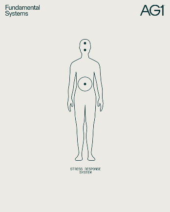
AG1: I have many thoughts and not even many about design. I like the brand work, it’s sleek, the art direction is good, it’s aligned with their brand purpose and audience. Their claims to “refine proven formulas” and “be backed by science” are reflected in their photography—GREEN. STRETCHING. BUGS. APPLES. It reminded me of my middle school science textbooks (compliment). I’m into it, it’s good and effective design.
However, I am always immediately suspicious of health and wellness brands when their marketing budget is as high and their ads are as ubiquitous as AG1’s—on podcasts, on YouTube, on Instagram, via influencers etc. I think they’re very savvy at marketing to people who are easily enticed by beautiful packaging and brand messaging (like me) to sell a product that is basically yassified Flintstone vitamins. It was proven to induce a favorable impact on your gut microbial structure, so that’s good. Do you know what else has a positive impact on your health? Eating vegetables.
I had a laugh looking through their animations (above), thinking about the designer getting briefed to make these. Molecules aiding gut absorption, phytonutrients moving together, extraction increasing potency. All very scientific, I’m sure. There’s no way these are accurately representative of real biological processes, right? And what do they mean? Is AG1 trying to convince us of product efficacy by showing little circles passing through big circles? Do they take us for fools? I think they do!!!
I think AG1 is a great case study in the limits of design when the product is mediocre at best. If animated diagrams have to do the heavy lifting, how good is your product?
I’ll get off my soapbox, but I’m curious to hear your thoughts on this.

LEGO: Joyful applications, functional type, inventive glyphs (bringing 130 of its iconic pieces into its font), what more could you ask for from such an established brand? They didn’t touch the logo, which I thought was smart and feels rare these days. The storytelling felt cohesive, bringing together the many brand elements—the blocks, the movies, the partnerships, the characters—into one solid brand umbrella. The team managed to wrangle 23 separate guidelines and 110 different principles into one place. The animations are delightful, the type echoes the block shapes, and the principles of play are centered first and foremost throughout all its elements, while still maintaining simplicity and care throughout. I only have positive things to say!


The team from Creative Boom predicts the type trends to look out for next year.
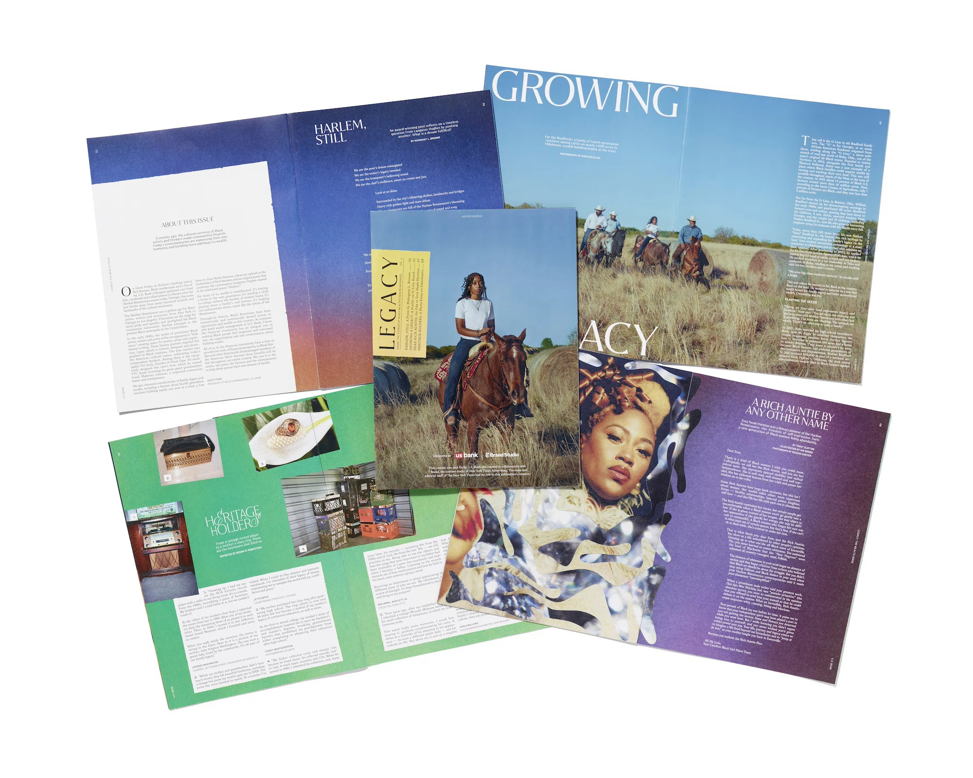
🗞️ NYT’s zine honoring the underground press of the Harlem Renaissance
Beautiful in its content and its layout. It’s always inspiring seeing new and inventive editorial design to highlight an important time and its people.
Taking direct inspiration for their hand-crafted approach from Renaissance print ephemera, specifically literary magazines such as The Crisis, Opportunity and FIRE!!, the series “highlights the pillars of commerce, community and culture through a series of essays, poems and reported pieces that amplify how the Harlem Renaissance continues to inspire a canon of thinkers, entrepreneurs and creatives today on a mission to build wealth,” explains, Tanisha A. Sykes, editorial director at T Brand.
🌀 What does happily ever after look like?
A visual exploration of the evolution of romance book covers trends over the course of twelve years. It covers the way trends moved through diversity, realistic photography, and illustrations.

🛠️ ColorZilla browser extension
Pick colors from in or outside your browser and copy the hex code right to your clipboard. I am upset I didn’t have this sooner.
Product designers are an interesting breed. Me as a marketer – do I talk about marketing with my friends? No. Do I tweet about it on the weekends? No. But design isn’t just a job, it’s an identity. And designers– they do not want to be marketed to.
On setting the tone for Figma’s config 2024. So many pieces of wisdom about understanding our own roles and building up others.

That’s all folks
Last call to submit any asks for the gift guide in a couple weeks.
Is there anything you’re looking for?
See you next time. On the first Monday of the month, you can expect Asset Library and on the third Monday of the month you can expect In the Clouds in your inboxes.
Those AG animations omg