


001: Can-core, NYT State of the Times, and Type Trends
If you're familiar with the María monthly link-out, this is that now.

Did you miss last month’s? No problem.
🧵 Chaos Packaging
This is something I have been noticing lately and haven’t been able to put my finger on why it’s bizarre. This person shows great examples and it reminds me of this article about why all advertising looks the same. This is like a mutated version of that
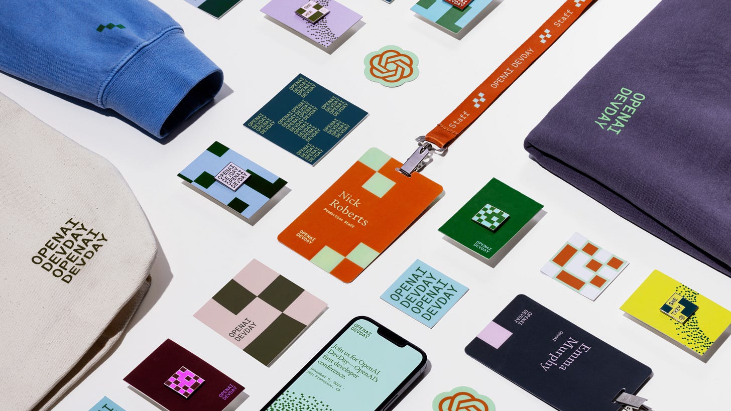
🗞️ Play Studio’s Open AI Conference Branding
I thought this was a modern and playful take on corporate conference branding that felt fresh and not soulless. It did make me think if the popular “dark moody color paired with bright pastel” would be the next Corporate Memphis, or is that too cynical? For the record I love those color combos, but have been seeing them more and more outside of CPG etc.
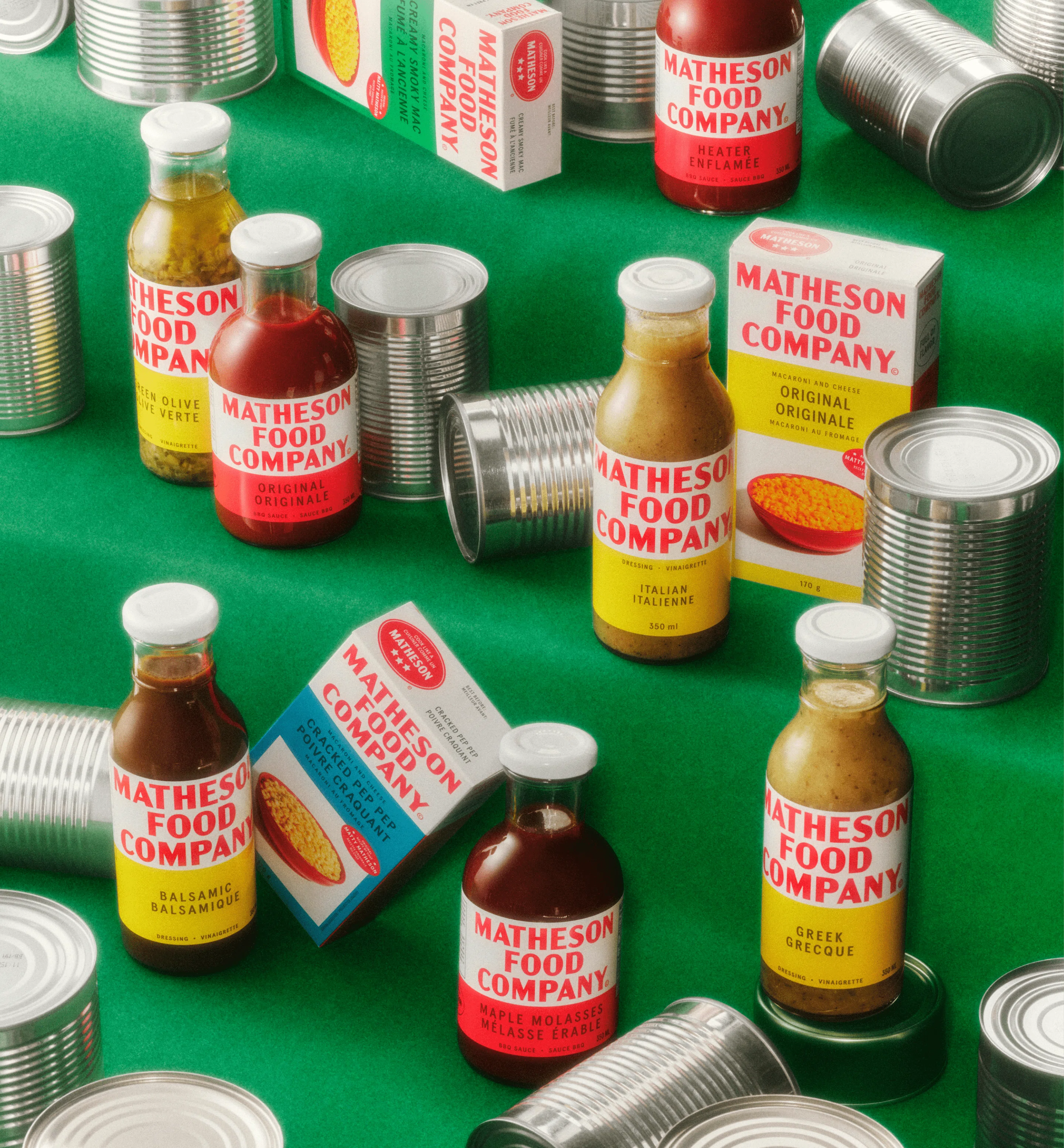
🗞️ Matty Matheson Food Company Packaging is can-core
I love it and I love him
🛠️ Grab any SVG from any website
This pissed me off and delighted me in equal measure.🧵 Q1 Social Trends Report from Rachel Karten
This is so smart and on point! Not sure how to balance knowledge about advertising without being a cynical little consumer all the time. Any tips?🛠️ Color Palette Generator
This site eliminated the need to have like 6 websites cued up for different color picking needs.🗞️ NYT Staff Conference Branding
Again, another example of modern and exciting corporate event branding that feels fresh and not soulless. I love their inventive use of motion and 3D space using 2D assets. Same note as above on the color palette though…
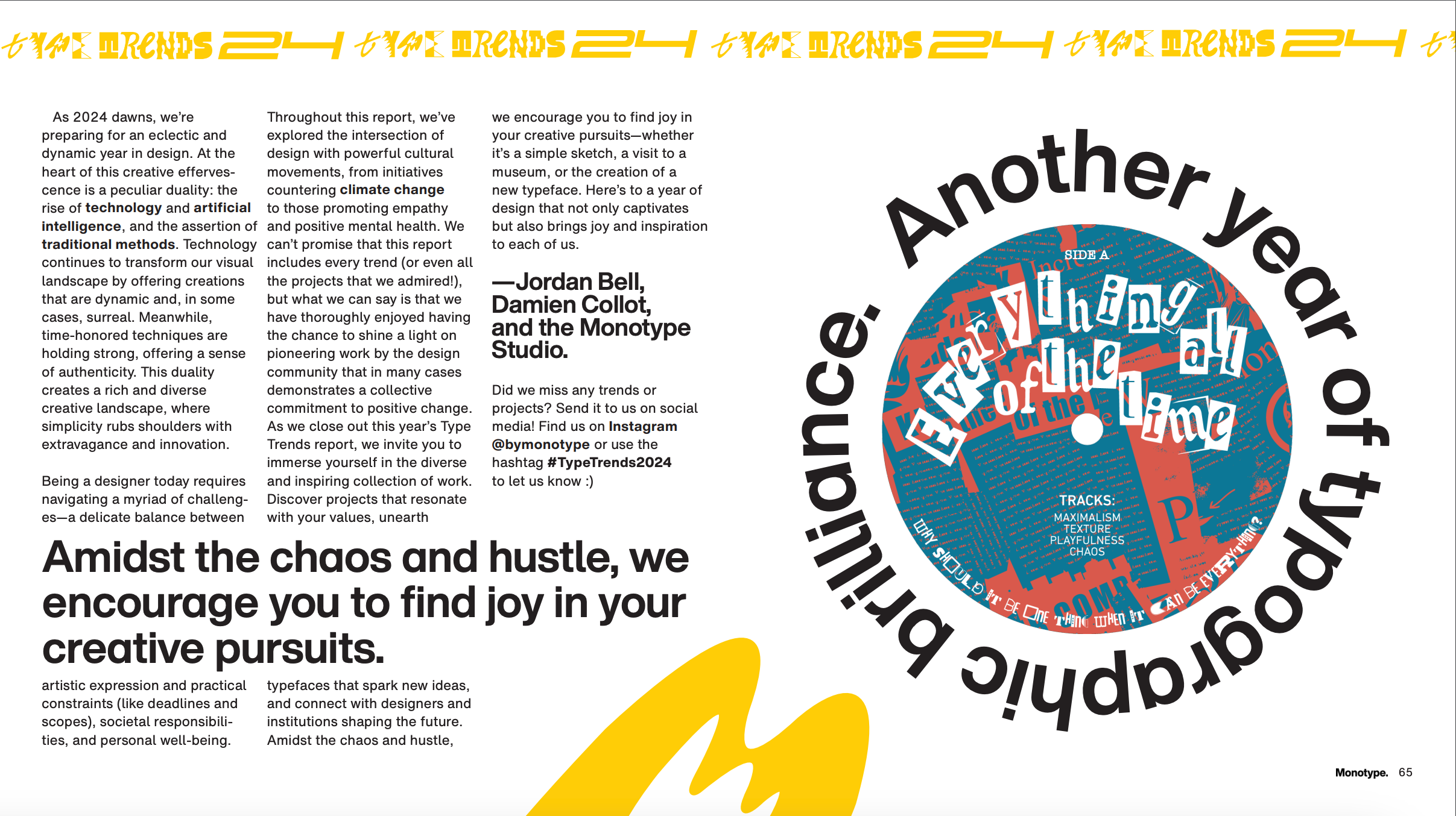
🎨 Monotype’s Trend Report 2024
Been waiting ages for this and now I can’t stop spotting these trends everywhere.


Thanks for reading this far. Be back soon with a non-design related newsletter I haven’t planned yet xoxo