


003: the 1968 Mexico Olympics, looking around, and the Apple ad
This month, I singlehandedly take down the Apple corporation.


Welcome to Asset Library, the newsletter where I share design recs on the first Monday of the month.
🧵 Being the World Champion of Looking Around
I mean!!! New goal unlocked!!
Apple’s craft is always so impressive, this thread is just people trying to figure out how they did it.
🗞️ Bringing us right back down from that Apple compliment, some thoughts about the bad Apple ad
I can kind of see how in the early steps of coming up with this idea, a team of people could think the concept for this ad is clever and it technically is clever (literally making something flat to showcase a product feature e.g. thin iPad), but I am not sure how this got past the many many layers of approvals required to release this?
This feels like something an exec heartily approved without reading the room. There is such a lack of reading-the-room-ness to the whole thing! Even the campaign’s name with a naive exclamation point at the end, Crush! I keep watching it and laughing because the metaphor of Tech crushing Art is so clear and obvious, there must have been another way!!!
I really try not to be such a pessimist and add to the pile-on but the way the ad was shared so enthusiastically by Tim Cook perfectly and depressingly depicts how Big Tech wants to flatten us like a pancake and eat us whole.
Also just realized that by the time you get this, this will have been old news (and the ad has been pulled) but that’s just the way of the monthly newsletter.🌐 Casa Bien’s website (and work)
So sleek and playful and their logo has a little guy.
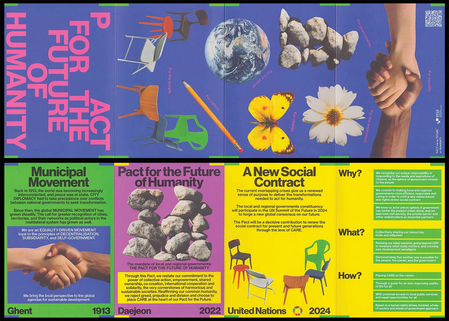
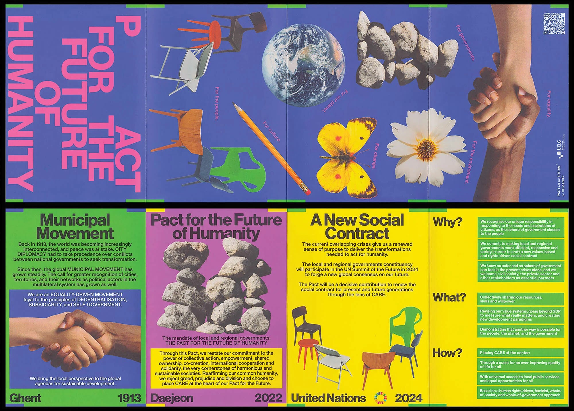
🗞️ UCLGs Pact for the Future design
🎨 Framework’s Branding
The whole concept is so clever and sleek. Love the use of the icon and the frosted glass motion gradients to convey hot and cold. It’s so satisfying. I think VC-backed spas all look similar but this is my fave one I think?
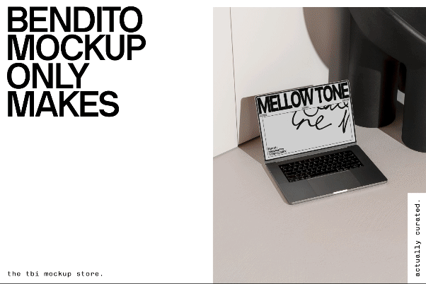
🛠️ Bendito Mockups
Chef’s kiss level mockups, I need them all.
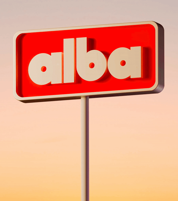
🎨 Athletics’ branding for Alba Larsen

I’m on an animation kick and I love seeing motion applied to branding, not only through animation but through static elements as well. The applications here felt smart and deliberate and I thought the bit about imbuing femininity was interesting and unexpected.
🎧 Beyond Mexico ’68: Lance Wyman’s world of design
Mexico’s 1968 Olympics Design is one of my favorite campaign designs ever and it was very cool and inspiring to hear from Lance Wyman about how he took inspiration from Mexico’s indigenous culture and how this campaign has remained timeless after over 50 years.
I also loved the way he talked about how Mexico City as a beautiful and graphic city filled with hand painted signs at parking garages and auto shops. I also find them beautiful and charming.


It also reminded me of an old episode of 99% invisible (shoutout Roman Mars) from 2017 I heard in college which really inspired me.
Fave quote: “Arquitecto, que pasa?”
That’s it, thanks for reading! byeeeeeee
See you next time. On the first Monday of the month, you can expect Asset Library and on the third Monday of the month you can expect In the Clouds in your inboxes.