


024: Spanish typography, Yakult, and ants
Plus 1870s little freaks. 🐜

Welcome to Asset Library, a graphic design newsletter where I share design, tools, articles, etc. on the first Monday of the month.

Hi there, it’s nice to see you again.
I’ll get right to it.
🫵 You may need to read this newsletter in your browser if it gets cut off.
Prompt 003:
Take a photo of produce in your home, upload it to your computer, and create a composition in a 1:1 aspect ratio.
Set a timer for 20 minutes.
With a lil process video included this time :)

🔤 Storefront typography in Spain
Some great type on storefront signage from my trip to Spain last month.
My favorite was the “Bodega” sign that looked like keyboard keys.

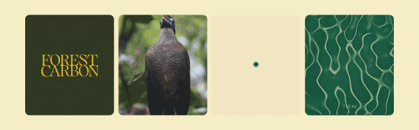
🖍️ Brand work for Forest Carbon by Design Bridge and Partners
Forest Carbon is a leading developer of carbon offset projects in the wetland forests of Southeast Asia. They recorded animals in their native habitats and used those recordings to visualize the sounds using frequency driven Chladni patterns. Turning sounds into visuals? Very cool.
I thought the work was a beautiful execution of an inventive concept. It makes the whole thing feel alive.
As an expression of the idea that a healthy ecosystem is full of natural sounds, the patterns are maybe a bit esoteric — most people won’t recognize them as graphic representations of sounds. However, I don’t know that that really matters. In videos, the motion of the patterns paired with their source sounds is especially nice, and conceptually more apparent. via Brand New

🗄️ Flickr Archive spreadsheet by Emma Bers
This is a crazy archival feat in documenting design and ephemera. It’s full of hundreds of collections across thirteen categories: vintage IKEA catalogs, vintage Italian posters, record store price tags, truck and van lettering, record store price tags, and more! After seeing this, I never want to hear people complain about how all inspiration sites are the same ever again.
Don’t let the spreadsheet scare you—it’s amazing!!!
🛠️ 12 quality mockup resources
One thing about me is that I will NEVER stop sharing mockup resources with you. Even when my proofreader/fiancé tells me I share too many, I refuse to stop.
My go-to is Artboard Studio—simple, easy, and compatible with Figma.
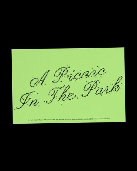
🔤 A picnic invite with ant lettering by Rob Farmer
Ants!! Very cool.
Type was made using Ouvrières and Honeymoon.
🐜 🐜 🐜 🐜 🐜 🐜 🐜 🐜 🐜 🐜 🐜 🐜 🐜 🐜 🐜 🐜
🛠️ How to write for non-writers by Brad Woods
This is a succinct, tactical guide to non-creative writing, aimed at software engineers and content creators.
I think junior designers are often underdeveloped writers since we’re often prepared to create good design, but not to explain it well. And great writing and storytelling can differentiate a good designer from a great one.
There’s tons of great writing about writing out there and I found this article could be a great guide to keep in your back pocket. Check out the references at the end if you’d like to go deeper.
Don't chase a specific writing style. Follow what you believe is good and over time, your authentic style will reveal itself. It is how you speak—your tone, humor, quirks, and perspective. The closer your writing aligns with how you naturally talk, the more authentic and relatable it becomes.
🎧 Play Mountain by 99% Invisible
This episode introduced me to Isamu Noguchi when I was in college. His sculpture, Play Mountain, came from wanting to give the children of New York their own special play place. It subsequently became the blueprint for modern children’s playgrounds.
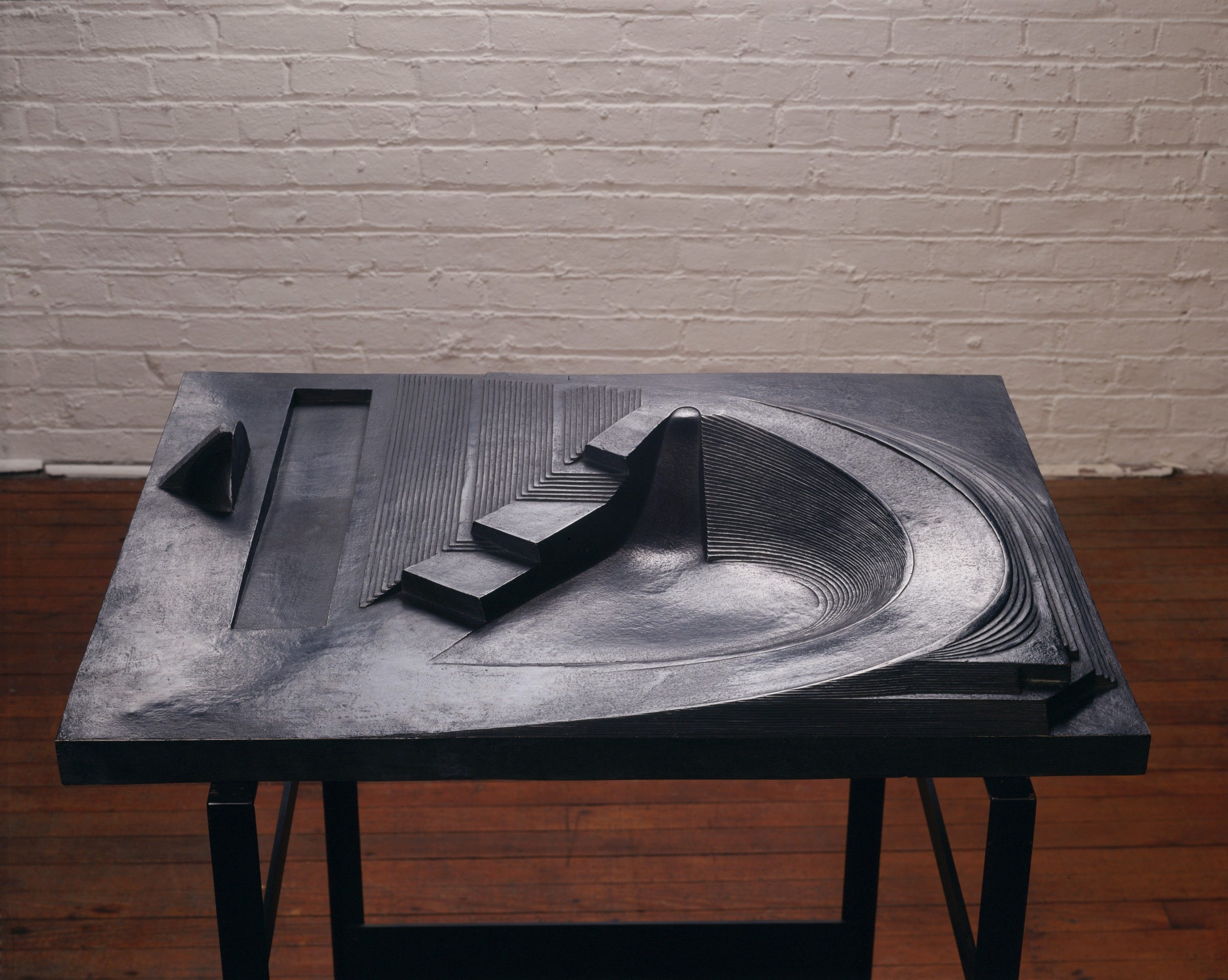
I think about it every time I walk by a playground or see his coffee table.
[Play Mountain] represented this idea that Noguchi had — that children didn’t need instructions to play. With swings or a slide, there’s only one way to use them and kids just do the same prescribed activities over and over again. If you give children an abstract, surreal landscape, they will be able to interpret it however they want. This philosophy would later be called “non-directive play.”
🗞️ More on following your dreams by
A complementary piece to what I shared on last month’s newsletter about choosing when to do what you love.
I love Haley’s advice on the big, small, and amorphous plights and quandaries of the human experience. Her gentle response to this age-old question is reflective and respectful of the mind spiral that occurs when you’re staring down the barrel of your future.
Not that if [luck] doesn’t strike, you’re doomed, but that luck—which we all need a little of, and usually encounter at some point, although some more than others—can’t lead you somewhere specific, but if you meet it with the right attitude, can lead you somewhere unexpected. I like this perspective because it actually favors the people who don’t necessarily know what they want to do (most of us), but are willing to throw themselves in a few different directions.
🖼️ Edward Lear’s nonsense botany (1871–1877)
These little freaks made me laugh.

🖍️ The Yakult logo
I <3 Yakult. It’s a Japanese probiotic drink that comes in teeny cutie bottles and is very popular in Latin America. My grandmother always kept it stocked in her fridge for health reasons and I would chug chug chug them all.
On top of being an excellent product, the logo goes hard. Love the t.

📖 Less is More: Limited Colour Graphics in Design
I keep this book by my desk and refer to it often. It showcases brand work with 1–3 color palettes. An incredibly useful source of inspiration to break out of the usual scroll.

Stay tuned for a special One Year Anniversary Special Edition newsletter next week. Goodbye now xoxo.
See you next time. On the first Monday of the month, you can expect Asset Library and on the third Monday of the month you can expect In the Clouds in your inboxes.
If you’d like to support the newsletter, you can buy me a coffee.
Please never stop doing these !
Oh my god this Flickr archive is GOLD. I love all of your ideas.