


018: Herman Miller, millennial packaging, and Cooper Black
Plus, a book on symbols

Welcome to Asset Library, my graphic design newsletter where I share inspiring and interesting design, tools, articles, etc. on the first Monday of the month.

Hi happy February and happy birthday month to me.
🫵 This is a long one, so you may need to read it in your browser.
🖍️ Herman Miller’s new identity by Order
In college, I got an internship at Herman Miller and one week later they called to tell me they were dissolving the program. A dream come true crumbled as quickly as it came. C’est la vie.
I love anything Order does. I love anything Herman Miller does. I love their furniture, I love their history, I love their perspective on design. I love how much of the history and personality they kept imbued throughout the work. Integrating color, elevating the HM symbol, using Söhne, one of my favorite grotesque typefaces. The whole identity feels so carefully treated and respected in its subtle refinement. It feels nearly perfect in the amount of design applied. It does not insist upon itself, it’s just good.
“Staying true to the history of the company, the identity system takes careful consideration in its treatment of each element. Each piece has been refined and expanded on to allow for a full range of brand expression with Herman Miller at the core.”

🛠️ Shots.so
A great way to create mockups if you’re not a designer or you don’t have access to tools like Photoshop or Figma.
🖼️ The lost art of movie titles
The Movie Stills Collection is doing incredible archival work in cataloguing hundreds of movie titles. I’ve been trying to look for wedding stationery inspiration in non-stationery applications and these are really doing it for me.

A great and ingenious creative practice!
flip flop (n.) 1. the process of pushing a work of art or craft from the physical world to the digital world and back, usually more than once; 2. a work of art or craft produced this way.
Cooper Black, the best curvy girl in the font book 🫶. New Spirit is a great Adobe option.
🗞️ Blackbird Spyplane on Millennial power branding
But you know that thing about how 1 in 200 men are descended from Genghis Khan? These days it feels like 8 in 10 “brand identities” are descended from 2015 Casper Mattress ads. Why do tinned sardines need to look like a storybook? Why does a hummus need to say it has “sunny vibes”??
The team from Figma explains the basics of design systems, how they work, and how they change the way you design.
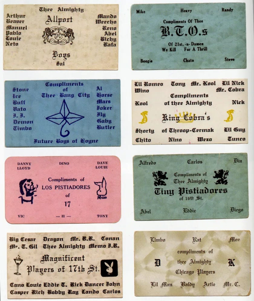
🖼️ Chicago gang business cards
These are so good!!! Branding is branding baby!!
You’re welcome.
Last month I mentioned I had a lot of design books to share. While this is not technically a design book, I think in any creative practice it’s important to have a strong foundational knowledge base and a general curiosity for the world around you.
This book is one of the best books I own. Whenever I watch a show or movie, I race to my book to look up the symbols. I try to read a new one every night before bed like a little bedtime story. It’s invigorating to learn new things and the understand the world around you.
The Book of Symbols illuminates how to move from the visual experience of a symbolic image in art, religion, life, or dreams to directly experiencing its personal and psychological resonance.


Thanks for reading! Since Valentine’s Day is coming up, I’ll plug my gift guide full of a mix of new and vintage thoughtful gifts for you and your loved ones. ok bye!

See you next time. On the first Monday of the month, you can expect Asset Library and on the third Monday of the month you can expect In the Clouds in your inboxes.
Those business cards!!!!
Siiiick collection of everything. Thanks!