


026: Script type, a museum search engine, and Pope Francis' aesthetics
Plus a great summer reading rec.

Graphic design, visual delights, and things worth noticing, delivered twice a month.
Heyyyyyy, this is the new Staring at the Ceiling where you get graphic design content plus a little more.

🔤 Cordier Script by Benjamin Gomez
I normally don’t love script fronts but I have been finding myself drawn to them lately. This one is elegant, natural, and refined. It could be yours for $90.

Put in your hex code and get a Pantone color. A useful tool worth keeping in your back pocket.
🖍️ Brand work for Unicode by Koto NYC
A really cool blend of physical and technological craft.
I’m a sucker for when brands use embroidery and fiber arts elements in a digital context. Their rationale gets a little heady but I buy it. Pixel=stitch, got it.
“‘We treat every QR scan like a needle dive: you pierce the surface, slip into a digital layer, then pop back out, threading two realities together in one fluid motion…showing that ‘stitch’ instantly explains the connection the tech enables without a word, and adds a crafted, human warmth most QR brands lack.’
This visual metaphor manifests in a distinctive, kinetic aesthetic world where digital, ASCII-esc illustrations, patterns and typography make imperfect analogue stitches. Beyond serving an ornamental role, however, the brand’s cross-stitch patterns harbour a far more functional service too. ‘It’s the master grid for layouts, icons, even motion paths,’ Arthur says, ‘so every touchpoint visually echoes that same connective thread.’ This reinforces the strategic narrative of the brand in every instance, all the while championing a satisfying analogy.”

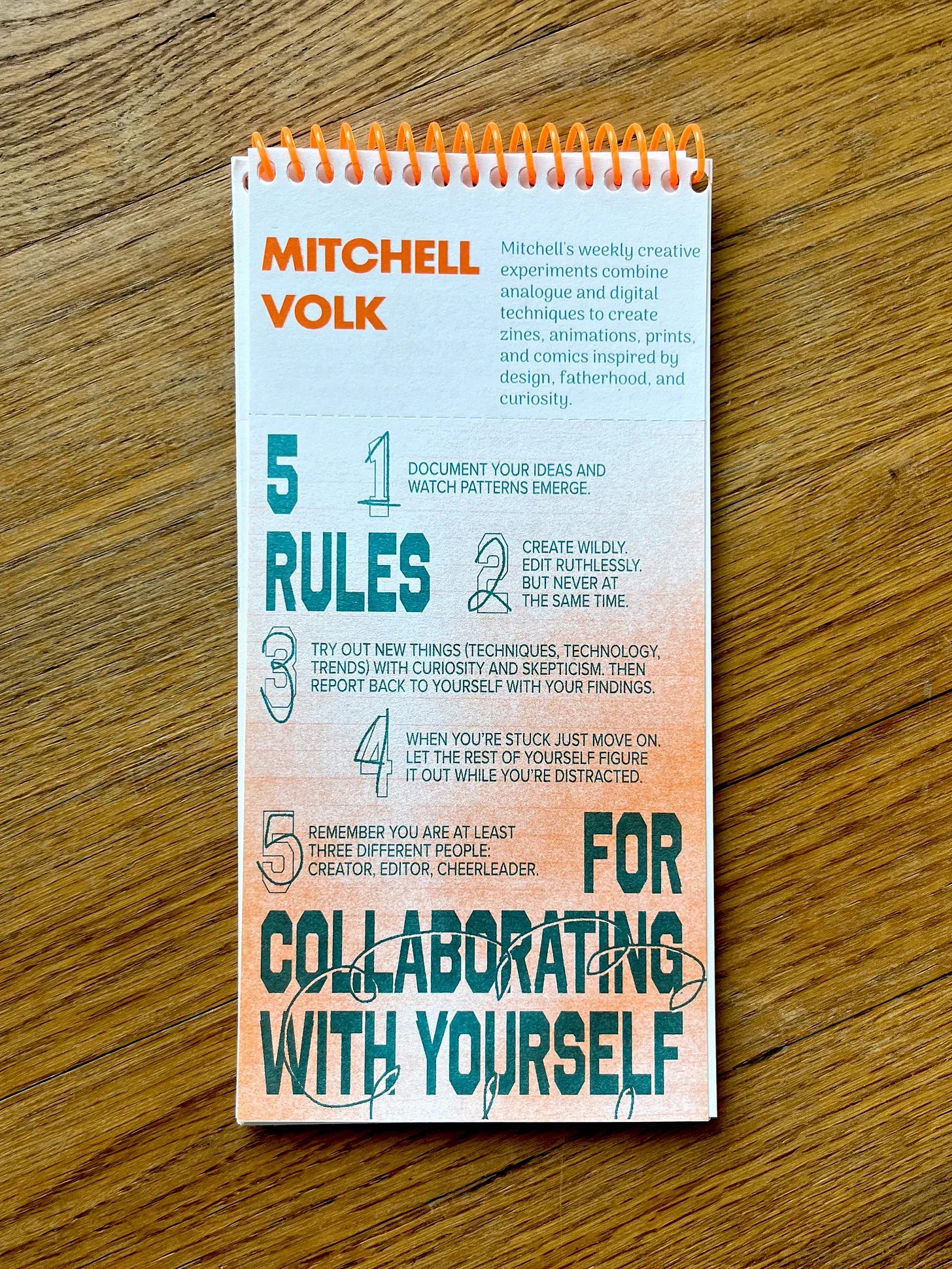
💡 Five rules for collaborating with yourself by
Words to live by! I want to print this out and keep it by my desk.
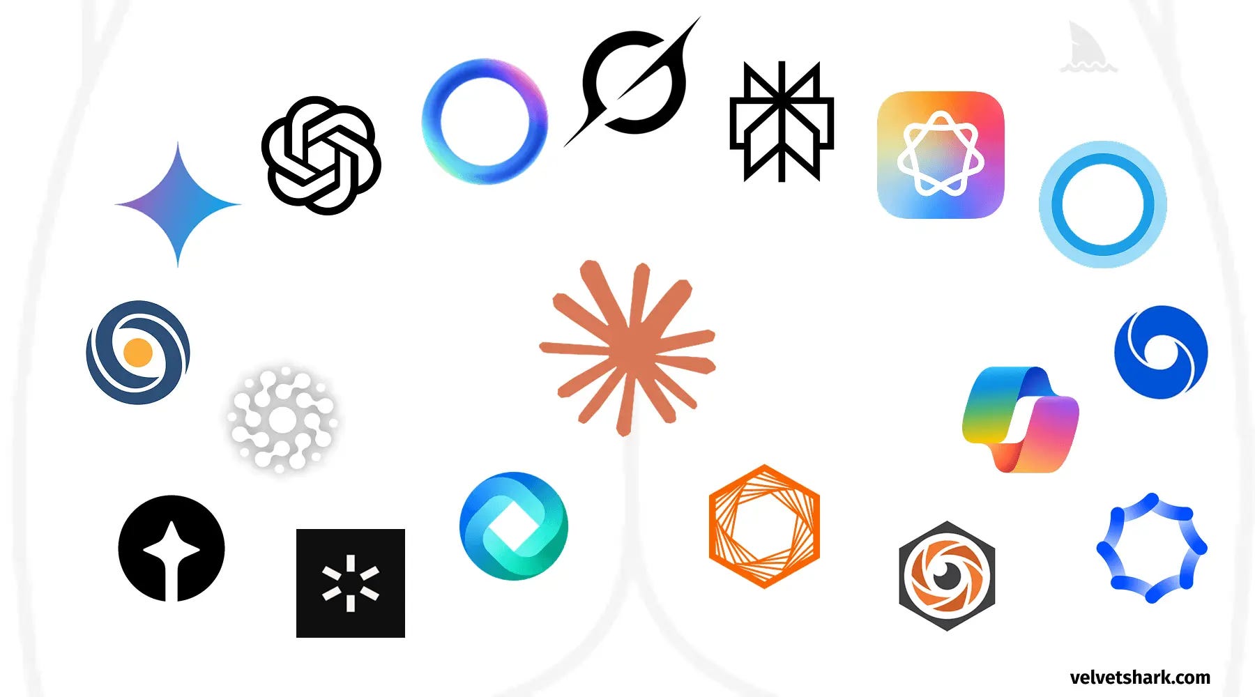
🗞️ Why do AI company logos look like buttholes? by Radek Sienkiewicz
A classic example of tech companies not wanting to stand out → everyone copies each other → everyone is buttholes.
“This phenomenon reveals something deeper about the tech industry: the fear of standing out too much. Despite claims of innovation and disruption, there's tremendous pressure to look legitimate by conforming to established visual language.”
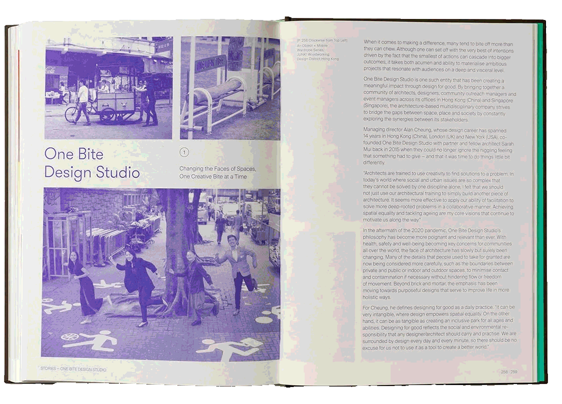
📖 Good by Design by Victionary
One of those optimistic design books full of multidisciplinary design work centered around changing the way we live for a better world. I like leafing through it for thinking-outside-the-box inspiration
Some more things worth noticing:
🛠️ Museo by Chase McCoy
A visual search engine connected to the Art Institute of Chicago, the Rijksmuseum, the Harvard Art Museums, the Minneapolis Institute of Art, the The Cleveland Museum of Art, and the New York Public Library Digital Collection. Very cool.
🗞️ How to write with style by Kurt Vonnegut
Yet another piece of writing about writing. This is clever and helpful and, if nothing else, entertaining.
Do not ramble though. I won’t ramble on about that.
📰 A Plum in One’s Mouth by my friend
Witty! Sharp! Subscribe!

🗞️ Pope Francis’ Aesthetics of Humility by Ed Simon
Through the lens of his dress and home, this writeup takes a look at a papacy that focused on humility and compassion his emphasis of art and beauty. RIP! 🕊️
“Art is not a luxury, but a necessity of the spirit. It is not an escape, but a responsibility, an invitation to action, a call, a cry…To instruct in beauty is to instruct in hope, and hope is never separated from the drama of existence—it crosses the daily struggle, the fatigue of living, the challenges of our time.”

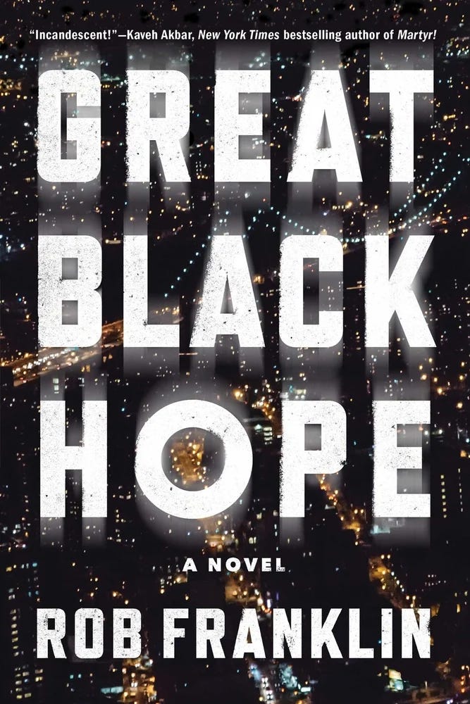
📖 Great Black Hope by Rob Franklin
My friend Rob wrote a book and it’s coming out next month. Pre order it!!!!
“A novel stuffed with witty, keen observations about the intersection of race, class, gender, and sexuality, imbued with a sharp wit that places Franklin in the company of such astute social observers as Edith Wharton and Henry James, and a must for readers of contemporary literary fiction. Readers of Rumaan Alam and Natasha Brown will be enthralled.” via Library Journal
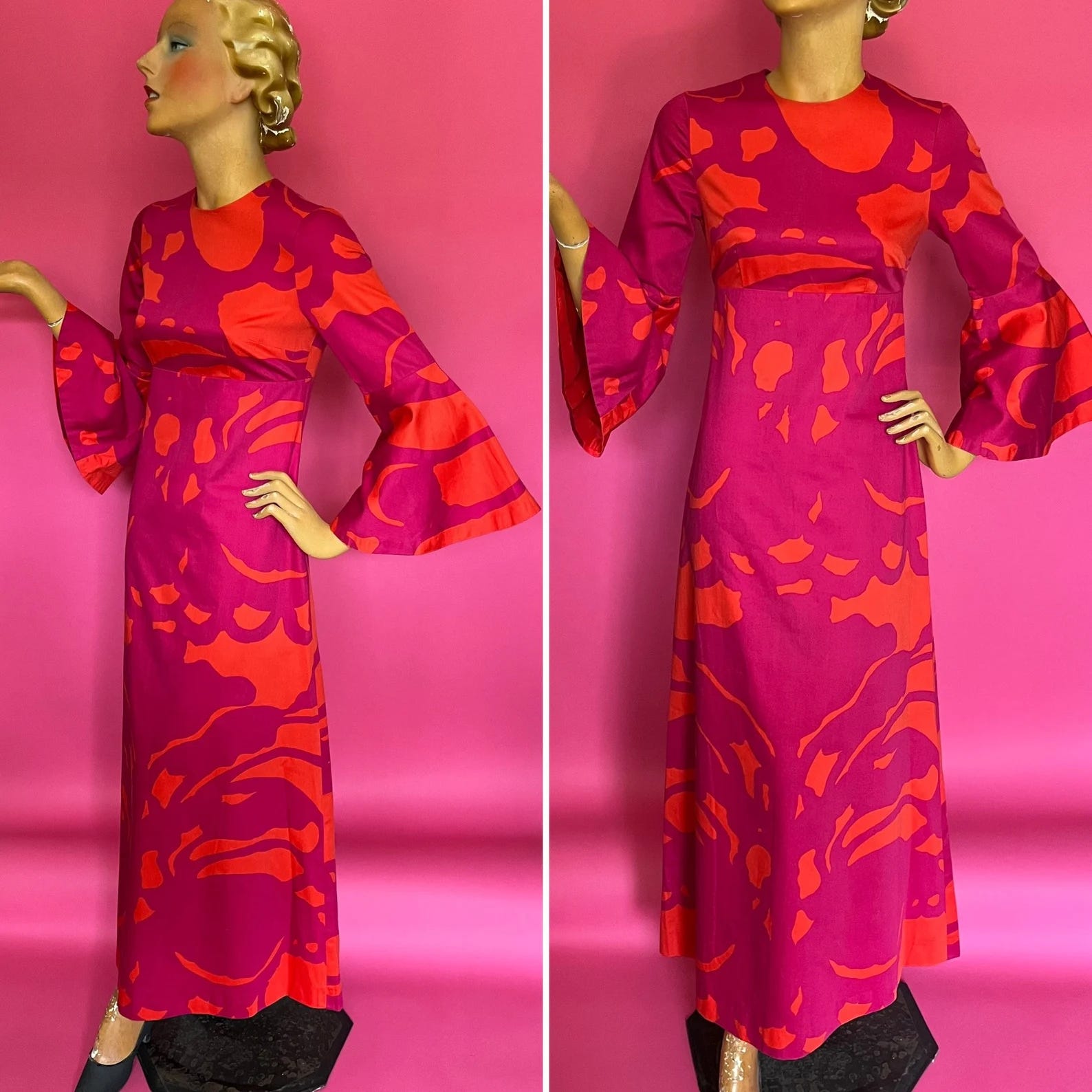
This would really kill as a wedding guest dress or just for a spring afternoon if you want to be glamourous. Bonus: this pink fringed dress.
🎶 The Background by Third Eye Blind
I have only been listening to 90s grunge/rock when I work out and Spotify playlists don’t offer a lot of variety so Third Eye Blind, Nirvana, and The Smashing Pumpkins have been on repeat lately. Call me corny, idc, this song is underrated. I also just realized their logo is Papyrus <3

That’s all. Bye now!
See you next time. You can expect this newsletter in your inbox on the first and third Monday of the month.
If you’d like to support the newsletter, you can buy me a coffee.
That T Magazine article on gardens is one of my favourites! Ended up falling down a rabbit hole and writing about the gorgeous French-style gardens that surround the Miller House in Columbus, IN
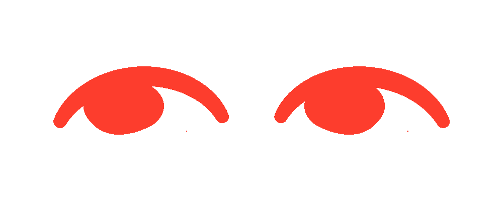
Hey thanks for the mention! Loving the new format. And those eyes at the beginning.